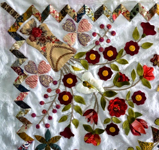
But you know me, another quilting day = another fabric dilemma. I have whittled it down to three most likely potentials with a few wild cards thrown in for good measure. Actually, I think they all work in their own way. The challenge is staying sympathetic to the centre and the overall scrappy feel as each fabric pulls attention in and from different elements in its own way.
 This green looks more complimentary in real life than it appears in the pics and is definitely a smooth choice. It really blends.
And it kind of grows on you as well. The more I see it, the more I like it.
I've been really taken by the HopeChest range and this tone of red just settles right in with my scrappy style.
It does take the quilt in a different direction, but that isn't necessarily a bad thing. And I like that I can potentially fussy cut for the border too. It's lively...but maybe too lively and I'm not sure I want to take any attention away from the hundreds (thousands?) of hours of work on the applique of this quilt. And yet, I keep pulling it out as a potential. There's something about it which really appeals to me. Mind you, I am making another LE - in red and white, so maybe this is too much.
It's not as stark as you might first think when it's in position
yes, it's charming, isn't it?
This is the leading fabric. Having been used in the compass, it blends. And the mustardy gold keeps it decidedly scrappy and Georgian. I do keep returning to it. Nevertheless, I find myself wanting to experiment with other options to be really sure before I commit. There's just too much at stake in this quilt to use the wrong border fabric. I wish I wasn't so indecisive when it comes to fabrics - I must admit that quilting fabrics and colours are my weakness. I'm not so undecided about anything else in my life. I really annoy myself with all this fabric auditioning sometimes. The problem is, I just see too much potential in everything!
This fabric is from the same range, but a different colour.
And I can't help myself, from day one, I have wanted to use polka dots somewhere significant on this quilt and yet they have never worked in my scrappy style. I think the problem is that I have such a soft spot for polka dots generally and am always trying to incorporate them into my quilts. I am going to design a polka dot BOM to get it out of my system - and use up all my polka dot stash at the same time. I've been thinking about this for a few years now and can never resist another spotty or polky fat quarter.
I'm sure I can't be the only one??
Much too busy. Finally I can strike one option off the list.
Even when it's an obvious 'no', I can't help but give the fabric every opportunity to shine!
Isn't this pink toned beige gorgeous? I love this antique style print. Although, seeing it now in a picture makes me realise that it's better suited to another quilt project. Maybe something more like Lily Rose.
I've narrowed it down between my mustardy gold, the light green and red. I will put LE up on my Design Wall, pinning the border fabrics in position and wait to see which looks best throughout the next three days when I'm not so intently thinking about it.


